Graphing with Matplotlib in OOP style. I often see many tutorials using the global state machine version of matplotlib while they are quick to use its often confusing and quickly becomes unwieldy when you want to reuse the code.
I often see many tutorials using the global state machine version of matplotlib while they are quick to use its often confusing and quickly becomes unwieldy when you want to reuse the code.
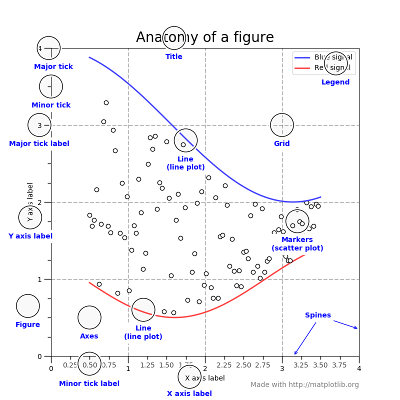
The best way to work with Matplot Lib is to look at the tutorials, Matplotlib has a guide explaining what a figure comprises of here:
Direct link to tutorial
We really want to use the object orientated pyplot in this case: OOP API Documentation As the global state API is pretty dated and really confusing, it makes it difficult for people to track what changes are occuring.
When I start learning an API I make sure I learn the typical workhorse functions for various tasks.
Heres the import statement we would require for getting this into a Jupyter Notebook
import matplotlib.pyplot as plt
import matplotlib as mpl
mpl.rcParams['figure.dpi']= 300 # MAKES CRISP
mpl.rcParams['figure.figsize'] = [10, 10] # MAKES DEFAULT FIGURE SIZE
%config InlineBackend.figure_format = 'svg' # MAKES RENDERING CLEAN
%matplotlib inline # ALLOWS INLINING IN THE NOTEBOOK
Standard OOP Usage
You will usually start by creating a figure and axes. Here we access the linechart via plot, and pass xs and ys.
You can find the Plot Types in the Documentation Here.
The core api design requires lists of data as xs and ys as np.arrays allows data to be plotted easier.
rows = 1
cols = 1

fig, axs = plt.subplots(rows,cols) # returns two objs
xs= np.linspace(0,100, 100) # create take 100 values between 0 100 so 0 -> 100
ys= np.linspace(0,10000, 100) # create take 100 values between 0 10000

# plot on the same axis

axis1 = axs
axis1.plot(xs,np.sin(ys * 2 * np.pi))
axis1.plot(np.cos(xs * 0.1 * np.pi ** 2))

axis1.set_title("Example Of Two Graphs") # title for the axis
axis1.set_xlabel("Sets the X Values automatically") # x label
axis1.set_ylabel("Sets the Y Values automatically as well!") # y label
axis1.legend(["Plot 1 Blue","Plot 2 Orange"],loc="upper right",title="Title Legend for Chart")
axis1.grid(color='black',linestyle='-', linewidth=0.05) # A grid for easier reading
Colors
How about changing the color of the plots? I not a huge fan of the plot colors? I prefer gradients so lets try and change that.
Heres a list of Gradients and Colors we can use and Map
rows = 1
cols = 1

import matplotlib.colors as colors # Need for normalizing the colors

# We create a function that will create a color gradient
def create_color_map(cmap_string="viridis",number_of_colors=10):
    color_curves = [i for i in range(number_of_colors)]
    normal = colors.Normalize(vmin=0,vmax=color_curves[-1])
    cmap = plt.get_cmap(cmap_string)
    scalar_map = plt.cm.ScalarMappable(norm=normal, cmap=cmap)
    colors_array = [scalar_map.to_rgba(i) for i in range(number_of_colors)]
    return colors_array

fig, axs = plt.subplots(rows,cols) # returns two objs

xs= np.linspace(0,10, 100)
ys= np.linspace(0,10, 100)
axis1 = axs
color_plots = []

number_of_colors = 10
color_map = create_color_map(number_of_colors=number_of_colors)

for i in range(number_of_colors):
    color_plots.append(i)
    axis1.plot(xs,np.sin(ys+i * 2 * np.pi) + i,color=color_map[i])

axis1.set_title("Example Of Color from Colors Graphs")
axis1.set_xlabel("X Values")
axis1.set_ylabel("Y Values")

axis1.legend(color_plots,loc="upper right",title="Colors Chart")

axis1.grid(color='black',linestyle='-', linewidth=0.05)
How about multiple axs’s in side a figure?
rows = 2
cols = 2

# Use oop methods
fig, axs = plt.subplots(rows,cols)

fig.tight_layout() # Fix issue with plots being next too close to eachother

xs = np.linspace(0,10,100)
ys = np.linspace(0,10,100)

color_map = create_color_map(number_of_colors=4)
for idx, axis in enumerate(axs.reshape(-1)): # turn it into a list you can also access via axs[0,0], axs[0,1], axs[1,0], axs[1,1]
    axis.plot(xs + idx, np.cos(ys + 5 + idx * 2 * np.pi) + idx, color=color_map[idx])
    title = "{0}".format(idx)
    axis.set_title(title)

axs[0][0].scatter(np.random.random(1000),np.random.random(1000),color = color_map[0])
axs[0][1].scatter(np.random.random(1000),np.random.random(1000),color = color_map[1])
axs[1][0].scatter(np.random.random(1000),np.random.random(1000),color = color_map[2])
axs[1][1].scatter(np.random.random(1000),np.random.random(1000),color = color_map[3])
You can find more about plots in general from here in the Plots
This was a short article to help you get into the work flow of creating charts! hope this helps!